THE ROBIN REPORT
Team of Graphic Designers, Marketing Coordinators, Brand Storytellers + Builders, Stakeholders, + Leadership
HAND-WRITTEN, AGAINST-THE-GRAIN, TRUSTWORTHY RETAIL REPORTING
The Robin Report was in dire need of a rebrand to enter the new age of news reporting. Collaborating with Shout Out Studio and StoryForge, we dove into everything that makes TRR tick. Crafted through months of stakeholder interviews, brand workshops and brainstorms, to restructuring of their business plan, and a full creative sweep of their brand the new Robin Report is ready to give the people what they want- real, exciting, retail news.
1. THE PROCESS
ASG acquired The Robin Report and was ready to breathe new life into the brand that provides relevant retail news and an unbeatable executive network. Brand exercises from a handful of agencies as well as internally produced countless pages of research to base a successful rebrand off of.
We assembled a small team of our internal marketing manager, one of our marketing and design partners, and myself as lead graphic designer and set off on our mission to rebrand the decades-old brand (pictured here).
We were crunched for time to wrap up the rebrand for production to have time to launch the new site and socials in a few months, so together we established a logical timeline of reviews, meetings with the larger team, and mile markers for production. From there we set up our collaborative workspace (Miro) and got to work.
2. IDEATION
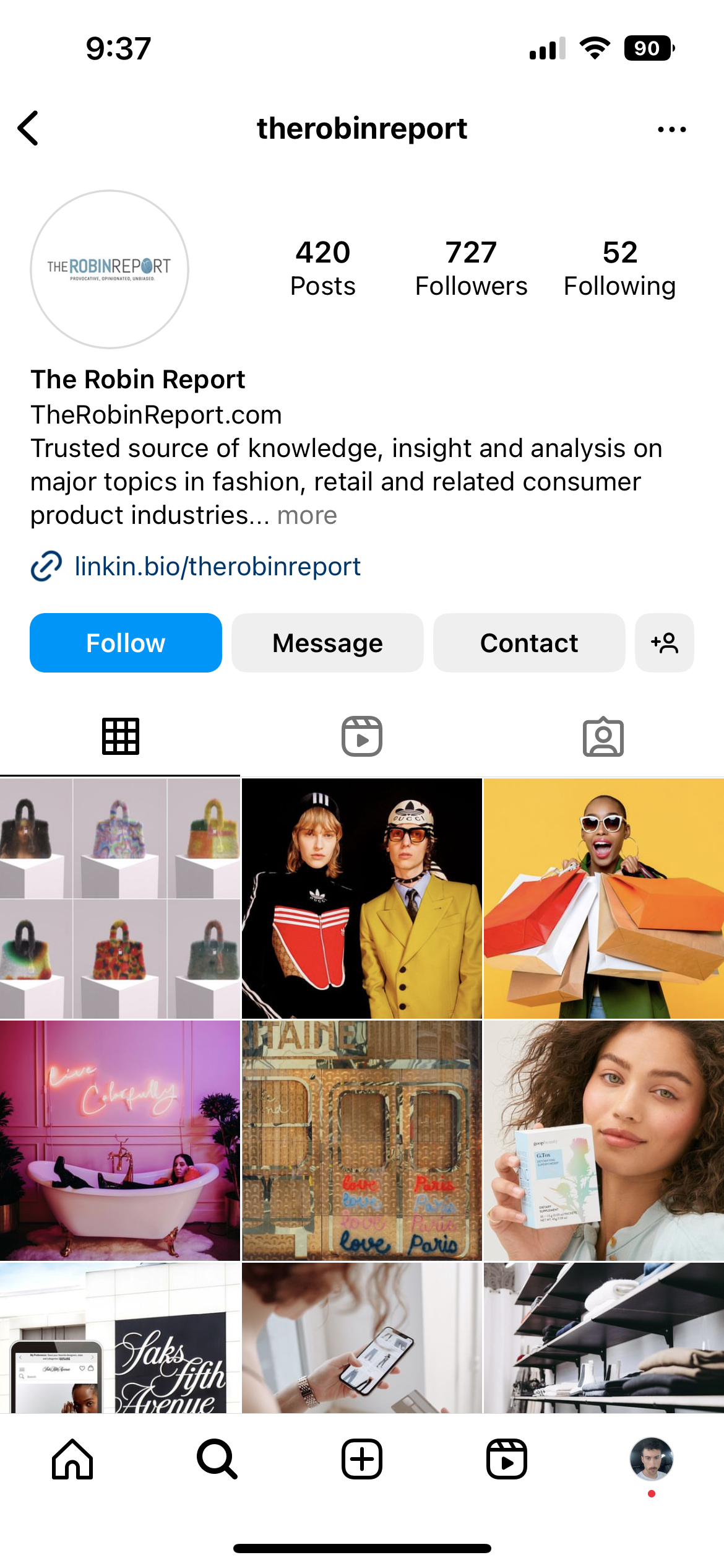
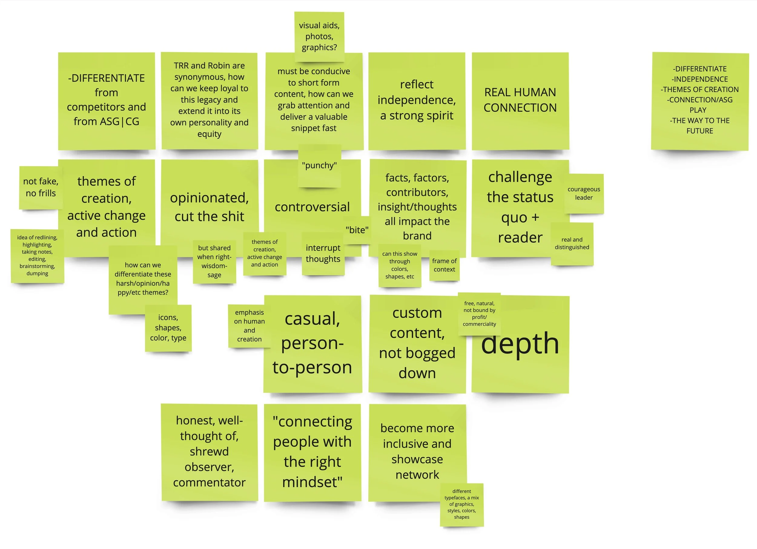
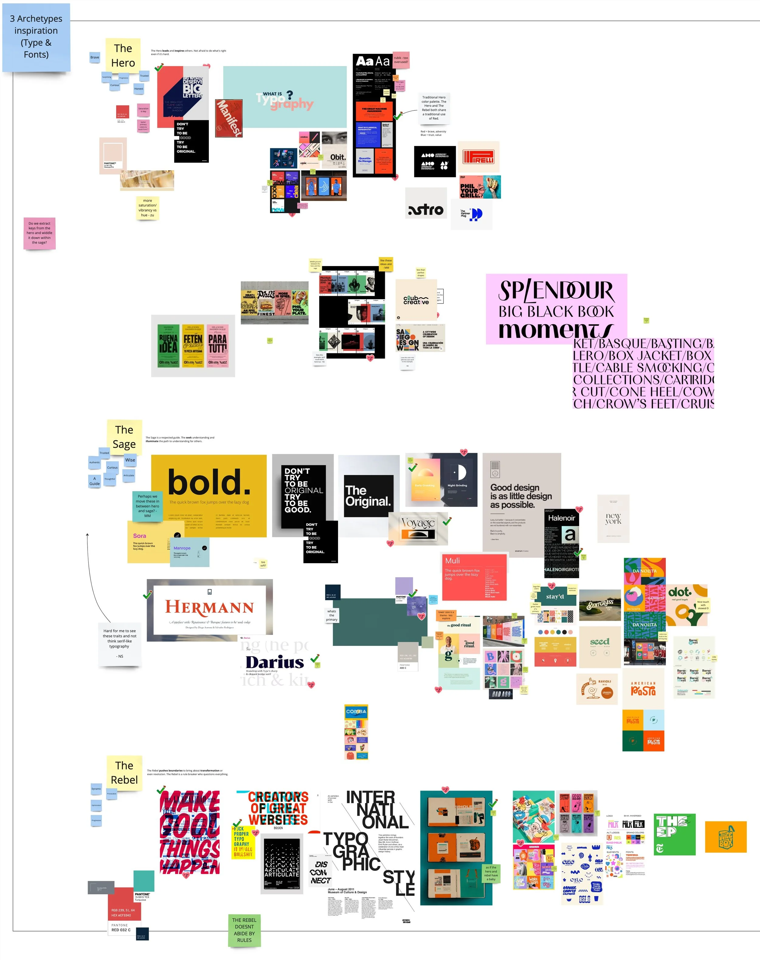
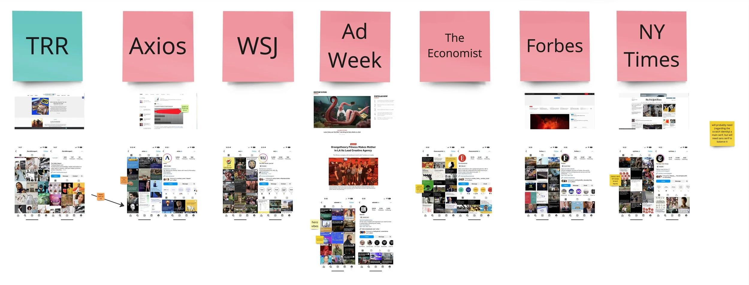
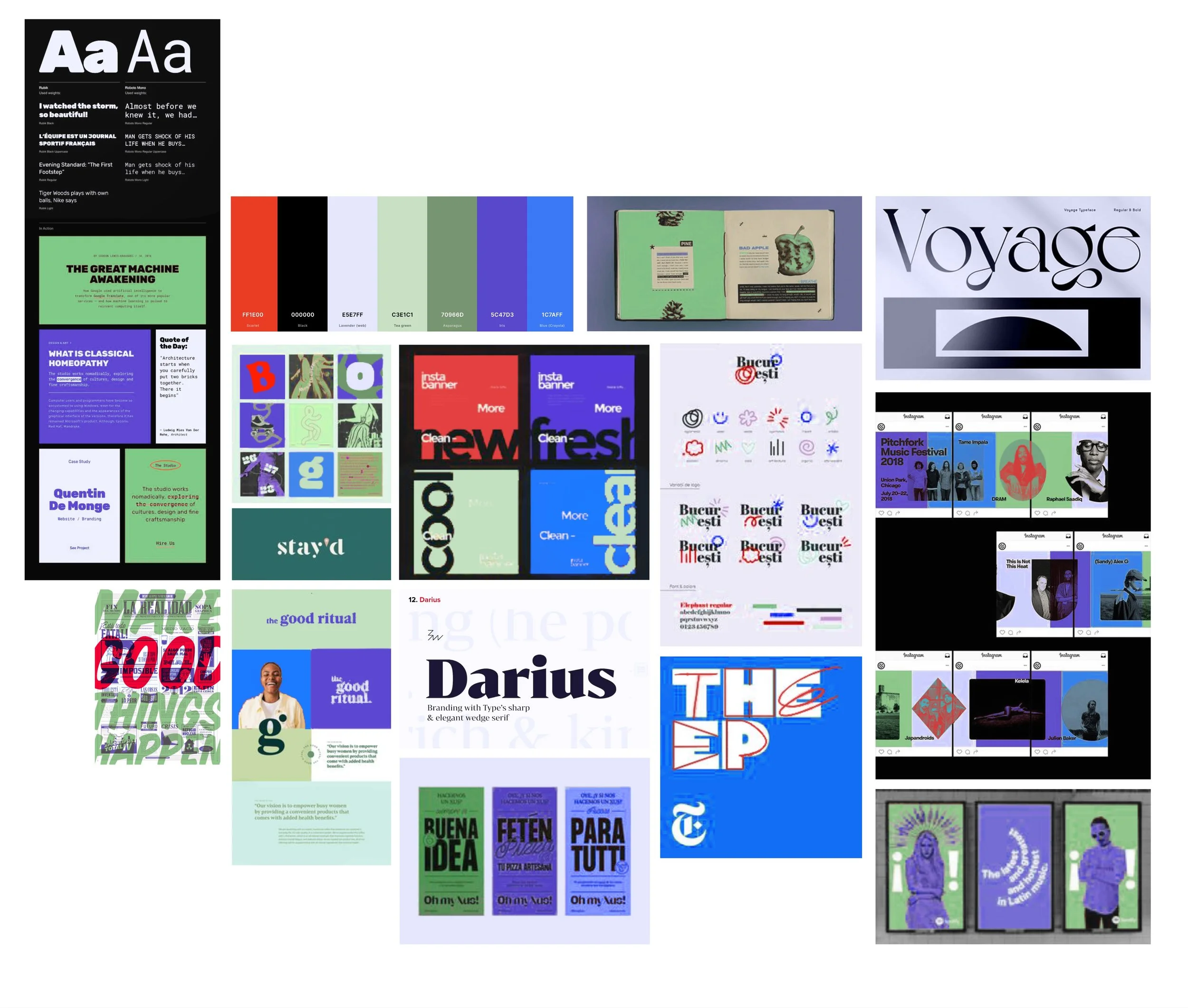
We first executed a competitor/emulator audit of content, language, imagery, and socials to see who we need to measure up against. Using the stakeholder interviews, we broke apart notable quotes and sentiments about The Robin Report that differentiated them from their competitors. Combining those notes with our audit and brand archetype work, we sourced imagery and brand direction. Brand archetypes and personality provided us with buckets to organize our search, creating a spectrum of sorts.
3. FIRST ROUND, 3 BRANDS
With all of our research and ideation we were able to boil our image sourcing down into a mood board to fuel our concepts. We created three individual, unique brands that answer the call coming from inside the house.
Our design team felt it was best to create concepts that push, reach, and stretch as markers for how different it is to their original brand and other news brands in the market.
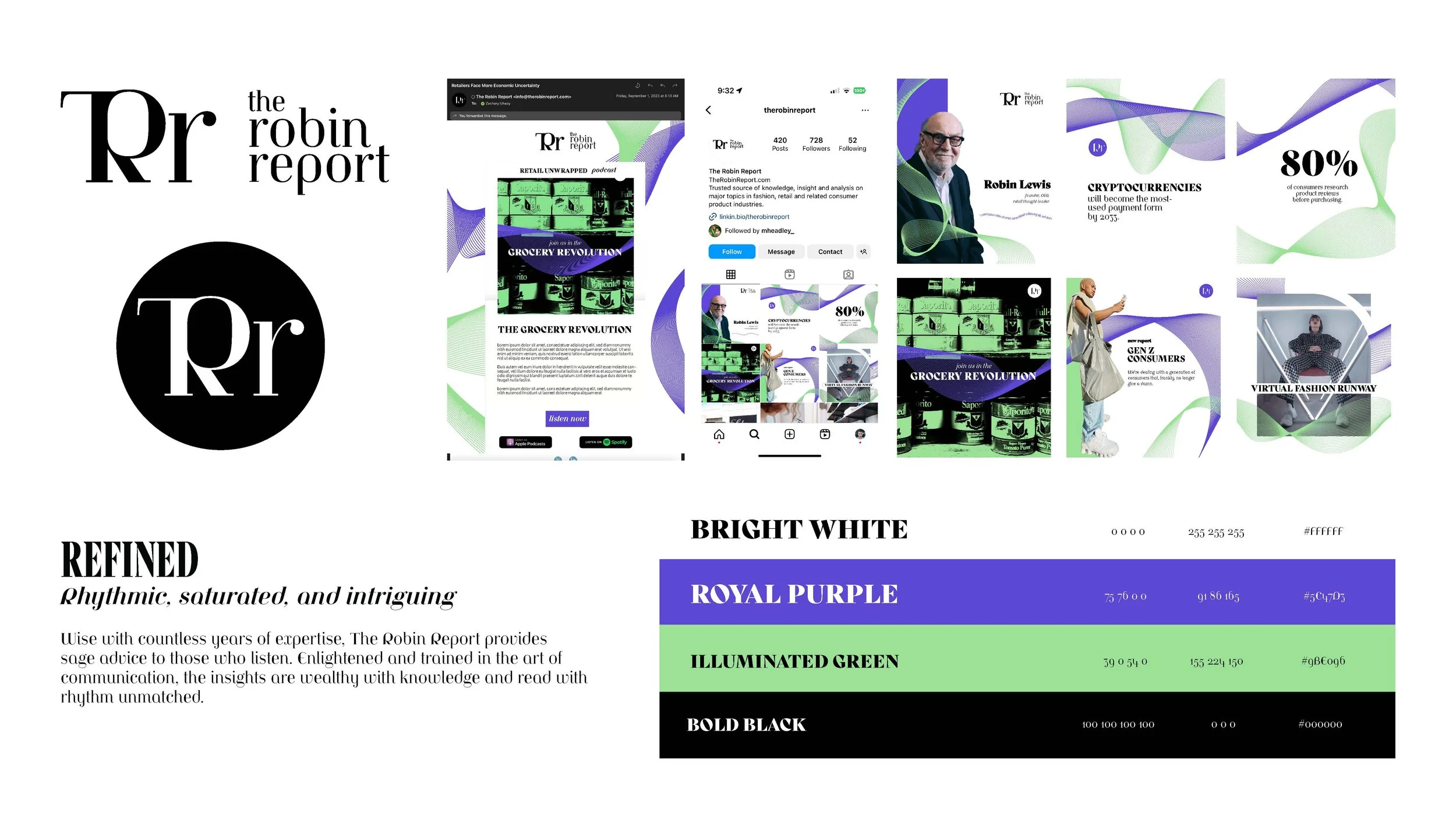
REFINED was our PUSH- the serif type, soft colors, and straightforward use of imagery/graphics defined this brand.
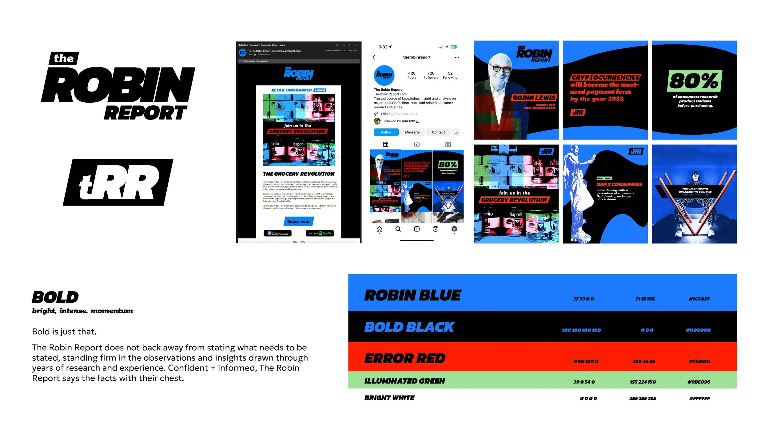
BOLD was our REACH- sans serif type, bright and energetic colors, and graphics edited to grab your attention in your inbox and feed invigorate this brand.
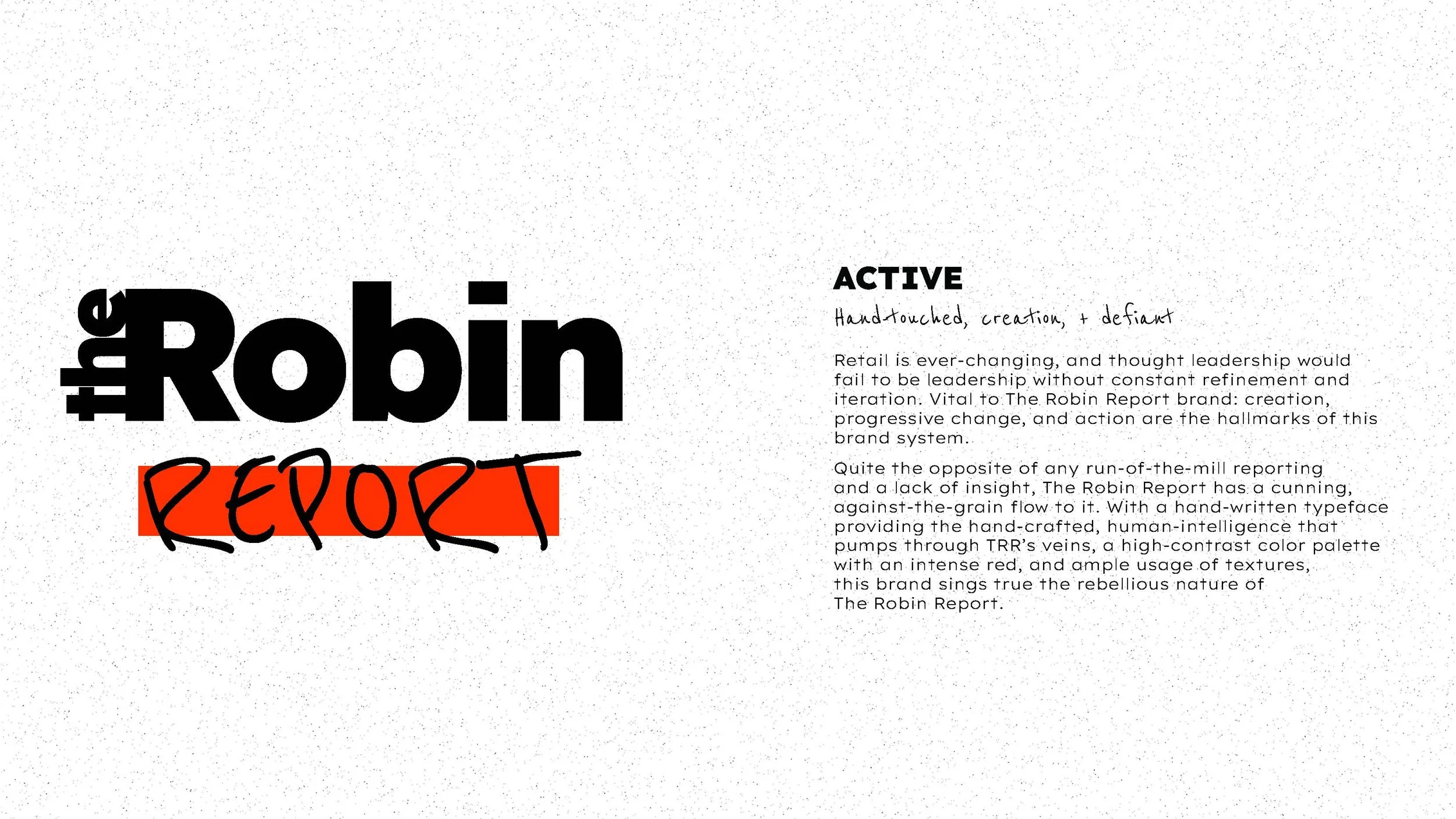
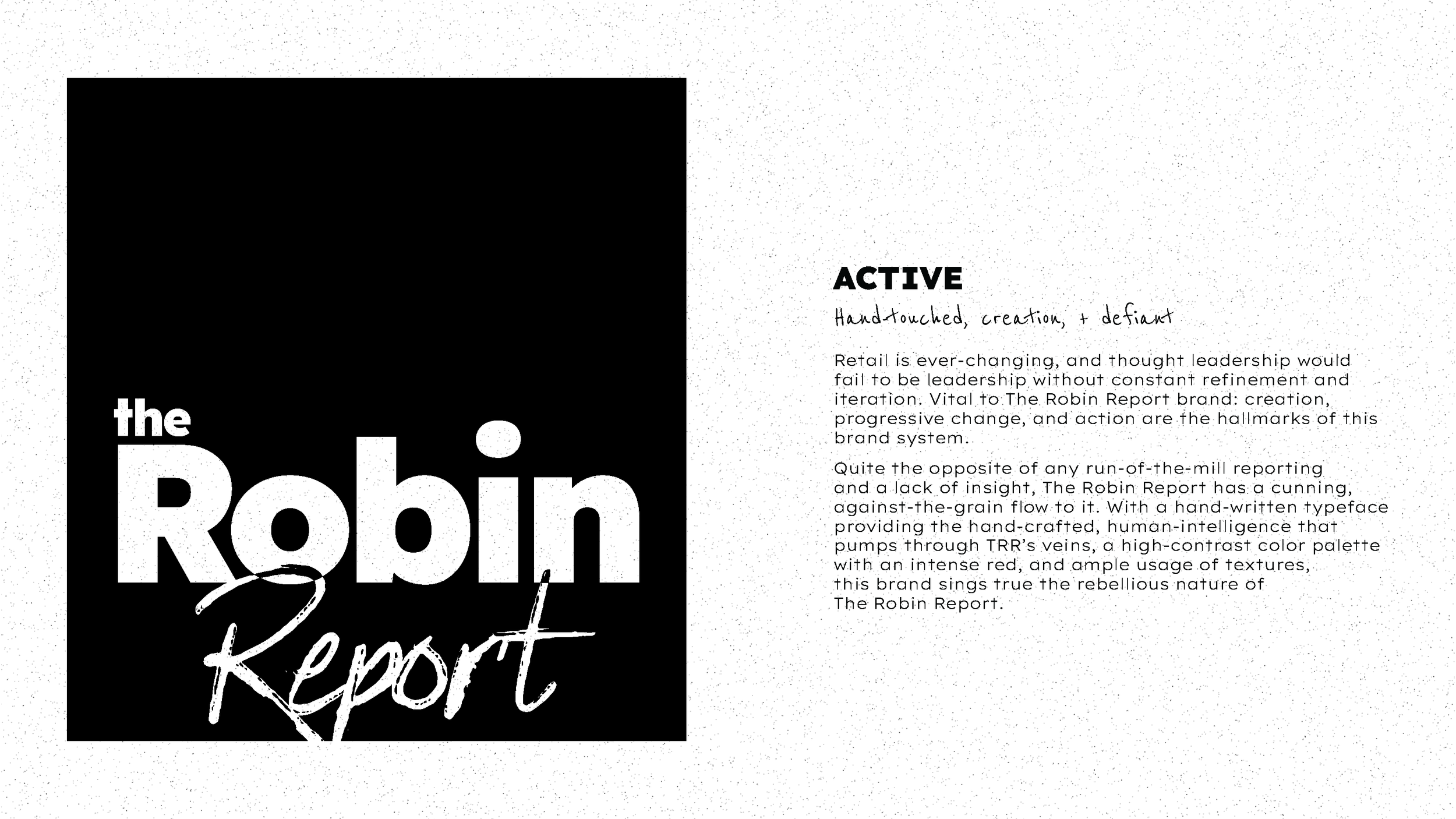
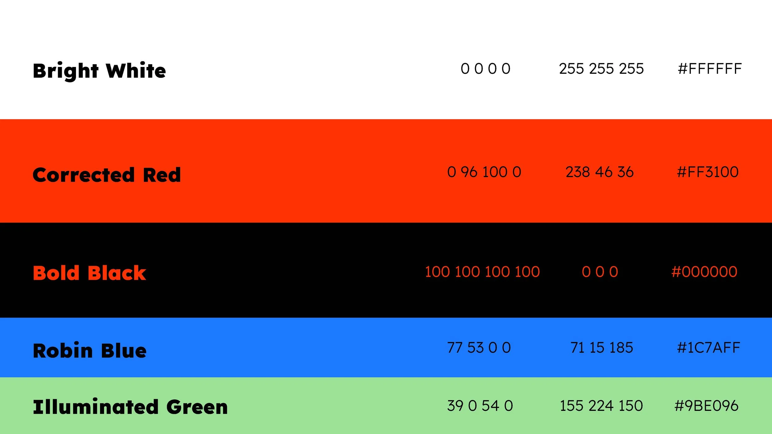
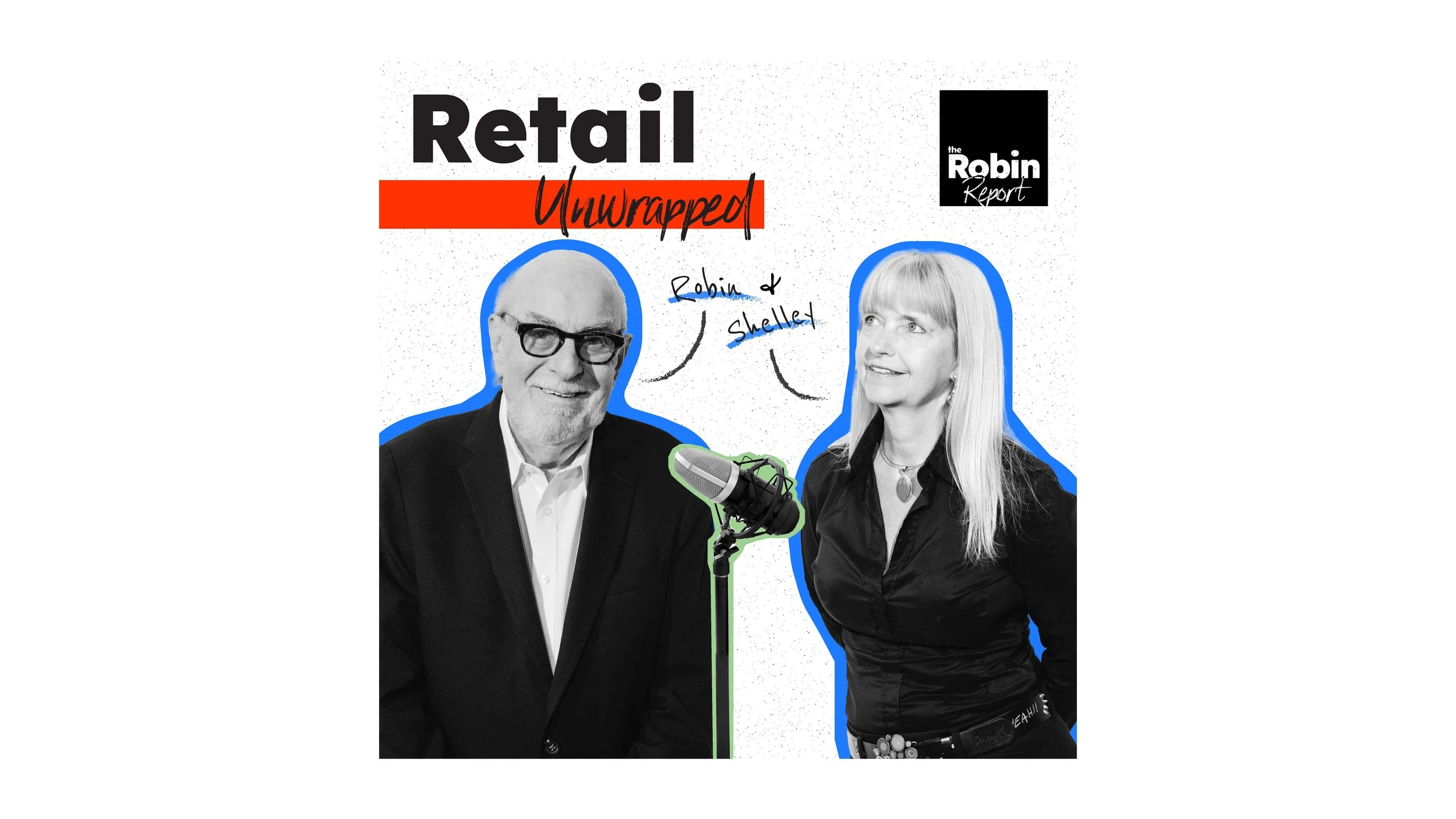
ACTIVE was our STRETCH- type emulating handwriting, correctional strikethroughs, and grunge-like graphics inspired by newspapers nail the personally-curated, opinionated takes asserted by the TRR team.


4. ROUND 2, ONE BRAND UNDER ROBIN
The stakeholders and our internal leaders were siked about the concepts shared in our initial review meeting. Following a feedback session, we had a clear direction to move in a united brand combining our BOLD and ACTIVE concepts. The team liked the attention-grabbing, news-like feel to bold, but the emphasis on personally-curated, evolving content behind active. Wanting to roll out the new brand by the end of the year, we worked quickly and efficiently to button up a fully-baked brand.


5. EXECUTION & LAUNCH
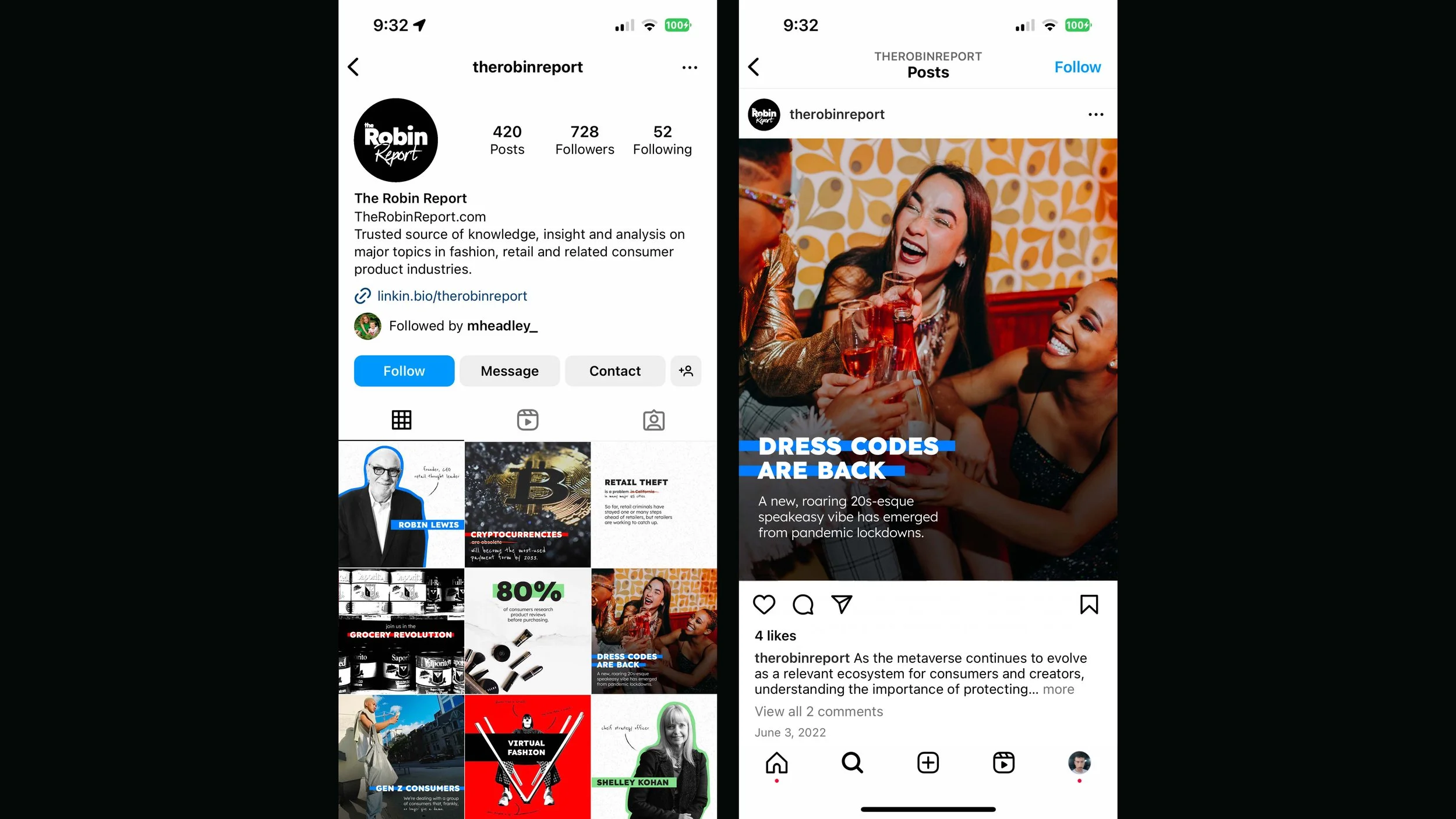
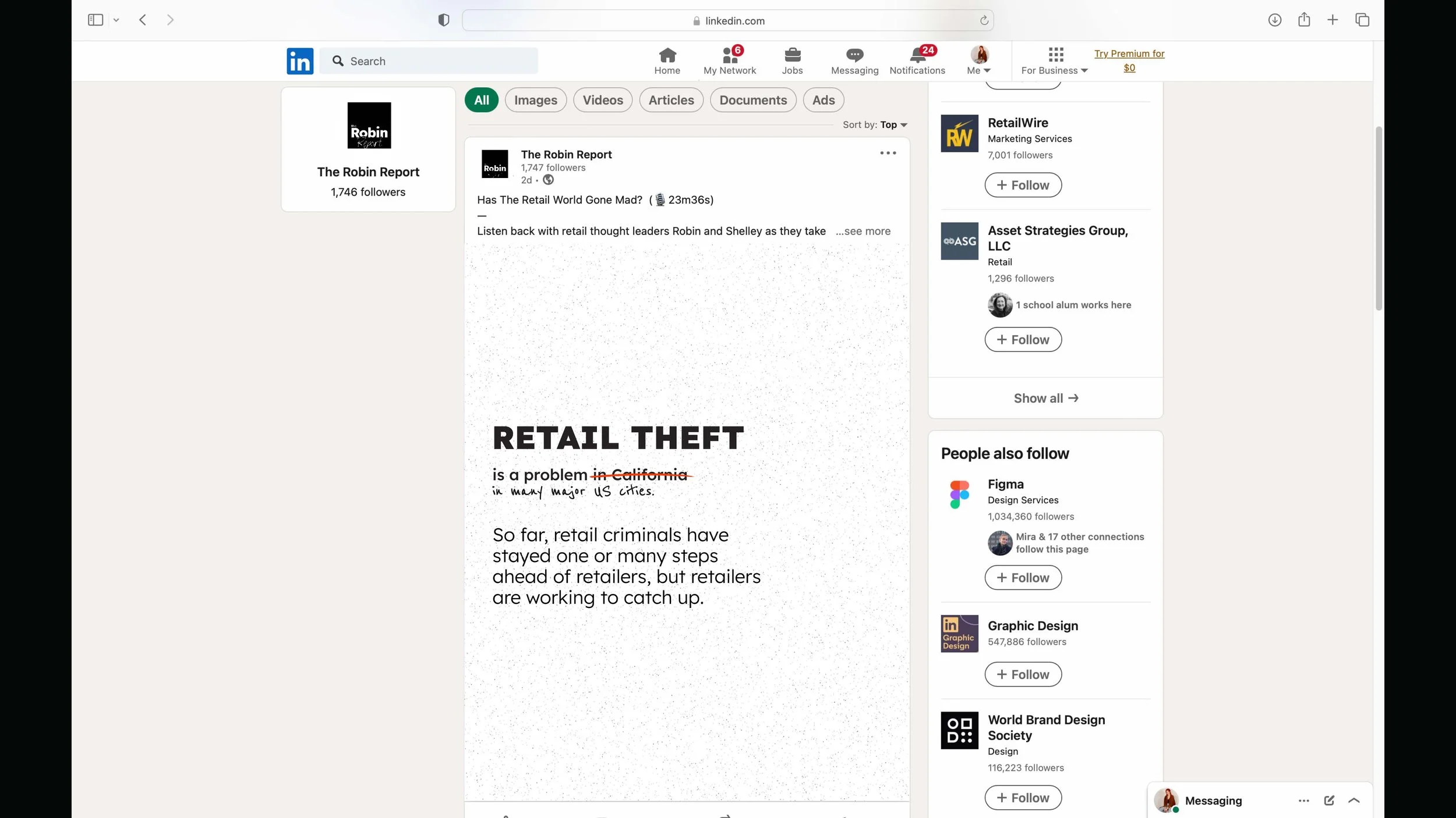
Concerns had been growing from the get-go about the recreation of graphics and images for social media posts and their daily email- and rightfully so, this is a news source who publishes 3+ articles daily.
Having worked alongside our marketing partners, Shout Out, who would take over the content execution of TRR, however, the team and I had developed the concepts to be easily-reproducible with templates and assets handy to whip up any graphic and image in a jiff.
As I spearheaded the template and asset production while building a comprehensive brand guide, Shout Out (having been working on migrating the back-end since our process began) developed the front-end of the site with my assistance behind creative direction. Seamlessly we worked together to set this brand up for success at launch.
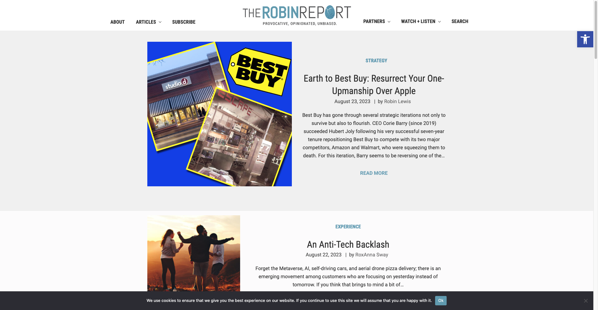
Visit the site here.